Anne McCarthy announced the fourth round of testing for the Full Site Editing (FSE) Outreach program last week. This testing phase calls for users to build a restaurant-themed header via the Gutenberg plugin’s site editor. Testing is open to anyone, and participants should leave feedback by April 8.
The testing process is broken down into 24 steps with both setup and testing instructions. Those participating will need to activate the latest version of the TT1 Blocks theme and the Gutenberg plugin.
The more people who leave feedback, the better it is for the project. The program provides that direct link between the user and the developer team that has often been missing in the past. If you have an hour or so of spare time, jump right in.
Building a Custom Header
I want to push the site editor beyond its limits, creating move advanced layouts. However, the site builder is so fundamentally limiting — and broken in some cases — that it is easy to become frustrated. And, depending on which version of Gutenberg you are using, such as the latest dev vs. stable version, you can get wildly different results.
This propensity to jump ahead of the lesson is something I have done my entire life. In school, I frustrated more than a few teachers. I would be working on stuff from the end of the chapter when they were still explaining the basics to the rest of the class a half-hour later. I have always wanted to get to the “good stuff.” Of course, I did so by blazing past the boring fundamentals. I also dropped out of software engineering twice in college because building calculators was neither exciting nor challenging.
Like always, I jumped ahead with Round #4 of the FSE Outreach Program. I came to the realization that attempting to do anything remotely advanced with the site editor was simply not going to happen.
I want Full Site Editing to be successful, but we are mere weeks away from the deadline that determines whether it will land in the next version of WordPress. Somehow this experience felt like a step back from where the plugin was a few weeks ago as I built a custom homepage as part of the second round of the FSE Outreach testing program. I do not know whether the problems stemmed directly from Gutenberg, the TT1 Blocks theme, or both. As someone who prides himself on near-infinite patience, Round #4 sought to crack me.
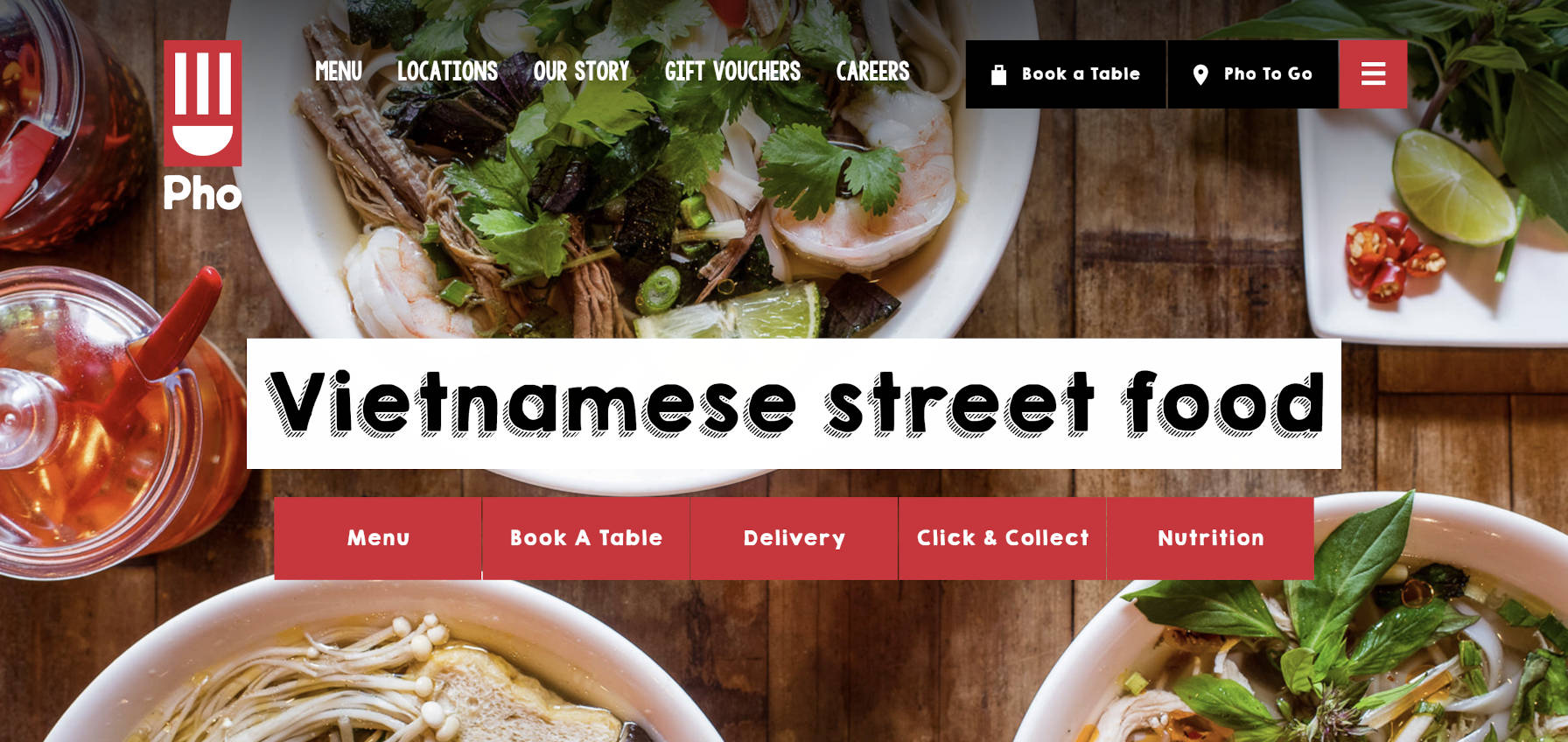
I wanted to recreate several elements from the UK-based Pho Cafe page header. I knew the site editor could not yet manage a one-to-one replication. I still thought I could pull in parts of it but utterly failed.

I appreciate the need for controlled circumstances. Step-by-step testing puts everyone on the same page, makes it easier to gather data, and allows others to reproduce issues. I am just bad at it.
Following the Rules
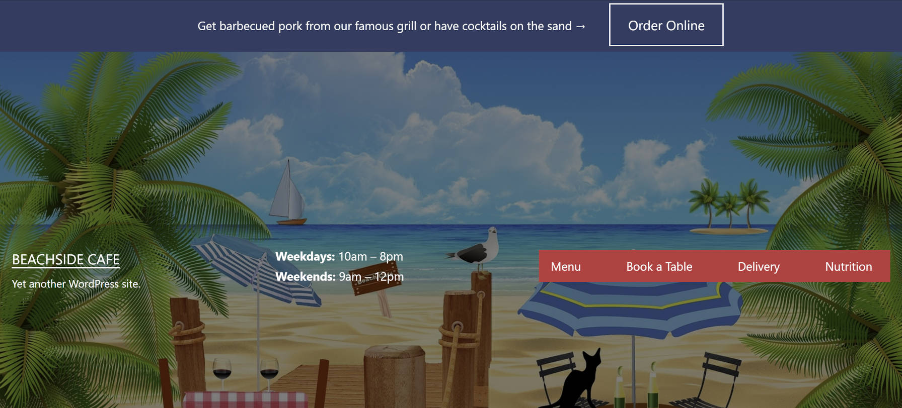
I restarted from scratch. I followed the rules. And, for the most part, the testing round was successful. I built a restaurant website header from the instructions and put my own spin on it.

Of course, I hit a few snags. That is what the testing program is all about — identifying pain points.
The most problematic issue is that what I saw in the editor was not what I got on the front end. I have played around with it enough to know in my mind what it might look like on the front end to make adjustments without previewing the changes. However, that is not the user experience that WordPress is shooting for.

Admittedly, on the front end, I tidied up the padding for the Group block and bottom margin for the Columns block for the “Order Online” strip across the top of the header. I thought about making the button smaller too. However, I stuck with the TT1 Blocks theme default. Ultimately, padding, margin, and other types of sizing/spacing should be customizable by the end-user.
Wide and full block alignments completely disappeared after activating TT1 Blocks. I am unsure if this was a recent change in the Gutenberg plugin or the theme. Nevertheless, they were gone, which was one reason I had trouble recreating pieces of the original page header I wanted to build.
The TT1 Blocks theme also has a hardcoded font-size for the site title link. This means that users cannot change the size of the Site Title block. I wanted to bump this up a little to make it more prominent.
Like the first design I was shooting for, I wanted my Navigation items to look like individual buttons, each with a bit of whitespace in between. However, the Navigation block does not currently support adding backgrounds to each nav item. Even if it did, it also does not have a horizontal margin setting to add the spacing. And, I outright refuse to use a Spacer block between items.
I did want to spruce my restaurant page header up a bit with a custom background. To do that, I added the primary elements inside a Cover block. Currently, the only way to do that is to copy all of the blocks, delete the old ones, and paste them into a new Cover block. A welcome enhancement to the editor would be an option for “grouping” blocks into a Cover like what is possible with the Group block.
