Twentig, the brainchild of sibling co-founders Diane and Yann Collet, now supports the Twenty Twenty-One theme. The developers originally built the plugin, which is hosted on WordPress.org, around the idea of “supercharging” Twenty Twenty. After its initial success, they have turned their sights onto the most recent default theme, adding a slew of new features over the past few months.
The plugin still supports Twenty Twenty. It has merely added features for the latest default theme to its repertoire. The duo behind the plugin does not plan to stop there either.
“Yes, we’ll definitively continue this with the future default themes,” said Yann Collet. “It will be exciting to see what we can do with Full Site Editing and the next block-based theme. With FSE coming, the opportunity is immense, making us confident that we can help people building better websites.”
When I last covered it, Twentig had a mere 4,000 active installations. All 34 of its reviews were five stars. Today, the plugin has accumulated over 10,000 installs and 75 five-star reviews. It did garner its first four-star rating, bringing the average down a tad. Nevertheless, its user base clearly loves what the plugin developers are doing.
The team has created 10 website demos and 8 single-page examples for inspiration, each on top of the Twenty Twenty-One theme.
-

Orlando -

Kyoto -

Letuce
One of the great things about the plugin is that it essentially treats the default themes as a bit of a foundation, a framework. Users do not have to search around for a new theme when they tire of their current look. They can simply mix things up with Twentig.
“The goal is to showcase the power and flexibility of Twentig, the default theme, and the block editor,” said the team. “And ultimately inspire people to be creative with blocks. It’s incredibly fun and fast to build directly inside the block editor with our block patterns instead of using a prototyping tool like Figma.”
Extending the Block Editor
The Twentig plugin’s strength is in how it extends the block editor. Users are first presented with a custom sidebar panel with a plethora of patterns and full-page layouts. The plugin then further provides options for individual blocks.
Unlike many other block-related plugins, Twentig does not register its own blocks. It uses the core WordPress blocks, except for Contact Form 7 integration, by mixing and matching them in various ways. If a user needs a call-to-action section, the plugin offers 11 patterns. If a user wants to spruce up their galleries, they have plenty of choices.

The plugin’s page layouts and patterns all work with both the Twenty Twenty and Twenty Twenty-One themes. Since Twentig relies primarily on core blocks, it is just a matter of making sure its custom CSS works.
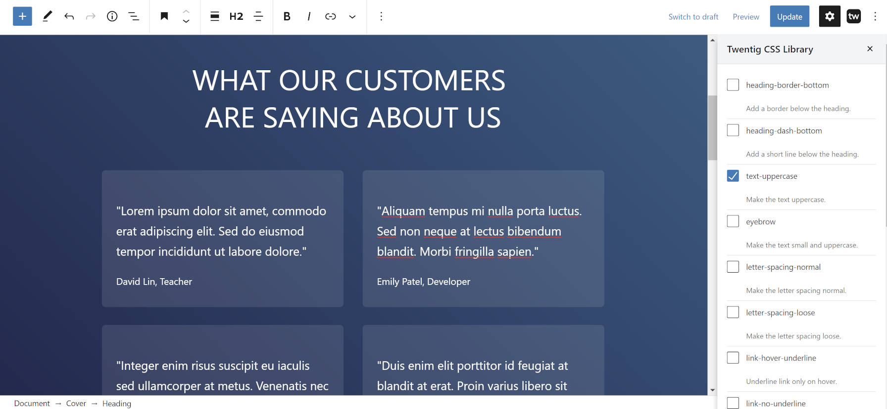
Some blocks get an extra setting or two through the plugin. However, the bulk of customization options happen through the Twentig “CSS Library.” This is a setting under the Advanced tab for most blocks that users can access by clicking the “+” icon next to the Additional CSS Classes option. It allows users to tick off checkboxes for numerous classes — each has an explanation of what it does. These are merely a set of utilities that change the block’s output in some way.

Twentig’s CSS classes system follows the road paved by utility class frameworks like Tailwind. WordPress does a little of this but does not take a holistic approach to it. I have argued that WordPress should build a design framework in the past. A standardized class system would play well with block options, giving the development team a foundation for creating a better user experience across themes.
The drawback is that the two extra stylesheets on top of Twenty Twenty-One’s CSS add a bit of heft to the page. This could give pause to users who want to keep things lightweight. However, it has a smaller footprint than when using it with the older Twenty Twenty.
Customizer Options and More

The plugin packages dozens of settings under the “Twentig Options” customizer panel. It also extends other sections, such as adding more color options. Users who care more about modifying the overall design than blocks will find nearly anything they need to put their own spin on their sites.
Everything from fonts to site layouts to what post metadata to show is covered. Users can also switch between stacked and grid-style blog posts designs while further customizing based on their choices.
The biggest downside to the plugin’s customizer integration is that it does not utilize the live preview functionality with most of its options. Making a change means a frame refresh to see its effects. A little bit of custom JavaScript and a few partials for server-side changes would go a long way toward making the experience better.
Ultimately, future versions of Twentig will rely less on or not at all on the customizer. If Twenty Twenty-Two is a block-based, FSE theme, such customization will happen in the upcoming site editor. The plugin developers will need to change tactics and find ways to extend the experience in new ways.
