Gutenberg 11.6 landed yesterday. Contributors added dozens of enhancements and bug fixes. Admittedly, there was not a whole lot that excited me as a user about this release.
Typography options for the Post Title block. Nice.
Cropping for the Site Logo. A necessary addition.
Toolbar button for converting old Gallery blocks to the new — still experimental — format. Sweet.
For the most part, the release felt like a slew of routine enhancements that have been in the pipeline for those of us closely following the plugin’s development. Almost boring. And that is not a bad thing at all. Less excitement and smaller doses of iterative improvements can be healthy for the project and its developers. We do not always need to feel like we are chasing the next big thing. This is a well-rounded release that polishes many areas, from navigation to widgets to general block enhancements.
There were two features that I am happy to see movement on. That is the site editor’s Global Styles system and child theme support.
Global Styles Updates

Global Styles is the system that will truly connect end-users to theme developers and vice versa for the first time in WordPress history. We have made some attempts at this, such as the customizer. However, this feature will handle it on top of the standardized block system.
Essentially, themes will talk to WordPress through their theme.json files, and users will speak the same language through the Global Styles panel.
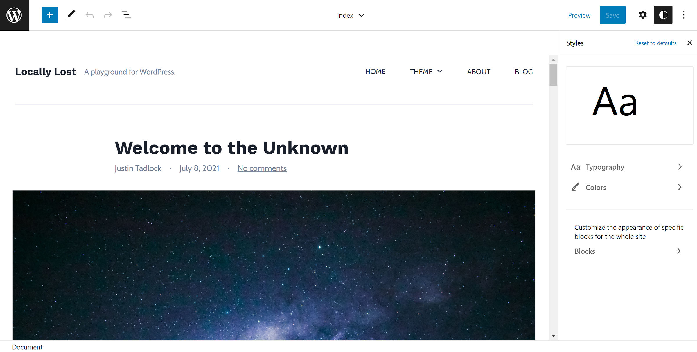
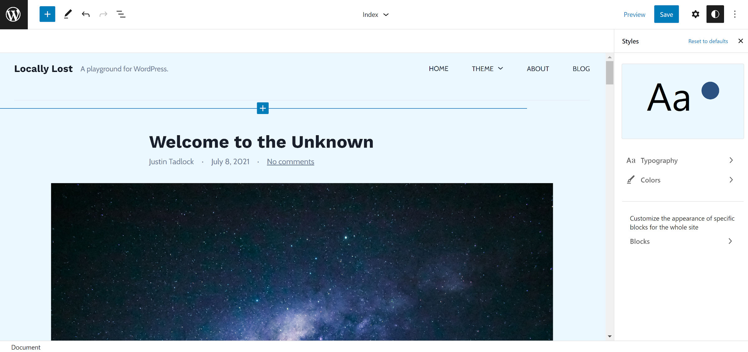
For example, imagine a theme author sets up the default text color as black and the background as white. This will appear on the front end of the site but also be reflected in the site editor. The Global Styles interface allows users to change those two colors to something they prefer. They can also see of a preview of their color and typography styles in the box at the top of the panel.

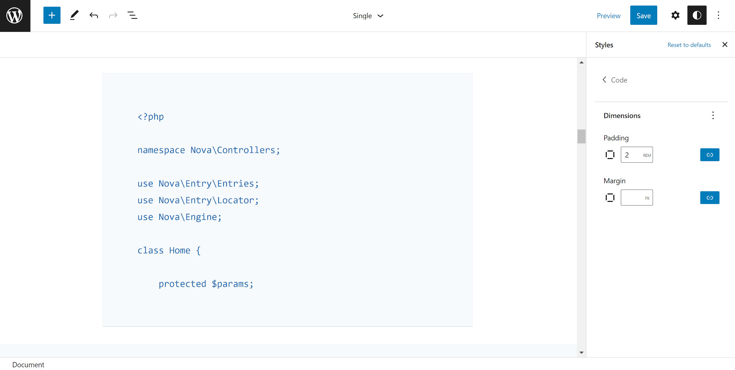
And, it does not stop at a couple of simple colors. Users can modify all sorts of design aspects like typography and spacing at the root and block levels.
Gutenberg 11.6 adds a navigation component to the Global Styles sidebar. Overall, it feels much smoother working through the top and sub-levels while editing my theme’s styles.

This is sort of a small but vital step toward overhauling the overall Global Styles interface. There is still much work to be done, but I am eager to see where the Gutenberg contributors take this component in the coming weeks and months.
I did run into one snag. Clicking on the Typography tab at the root level produces an error. However, it works at the block level.
Contributors also updated the old “Aa” icon representing the Global Styles panel with a half-dark-half-light circle button. My immediate reaction was that it was for switching between light and dark modes.
This was a sentiment shared by a user (from a now-deleted account) in the GitHub ticket.
Global Styles is not a new system disconnected from styles and themes, indeed is an improvement to the current themes system. If we were to consider the strength of WordPress’ past and present, we would perceive that on the dashboard, indeed a brush icon has been developed for years in people’s memory as an association with appearance, themes, styles, personalization. Therefore, the icon that would be most comprehensible in people’s memory regarding the new Customizer remains a brush. I say new and better Customizer, because this is how common people manifest what they understand about Global Styles. Departing from a pencil brush to yin-yang, moon, or water drop, I have not tested yet with public, but from past experience I assure you people are going to find this new icon unrelated and confusing.
Block Child Theme Support
As one of the pioneers of child theming in WordPress, using them long before they were officially supported, this is something near and dear to my heart. I created my first theme shop on this foundation. I have loads of ideas about how the block paradigm can reshape the theme space, and child themes are at the center of many of them.
However, all of the components of Full Site Editing have not entirely supported child themes until now. There are still a few pieces left to fit into the puzzle, but the system should work, mostly.
Templates, template parts, and theme.json files from a child theme should now completely overrule those from the parent. These changes work on both the front end and in the site editor.
Some open questions are being worked through in a related GitHub ticket. The most crucial development is still to come, which will handle merging values between the parent and child theme.json files. For example, it makes sense that child themes should be able to overwrite colors and typography while skipping definitions for layout-related values, falling back to the parent.
Once that is in place, designers will have an easy-yet-powerful way to realize the original vision behind CSS Zen Garden, a project that at least partially inspired child theming’s adoption by WordPress.
