A current proposal could spell the death of at least one form of child theming. The feature would allow themes to ship multiple theme.json files, housing variations on a site’s default styles. Essentially, it is the old-school concept of “skins.”
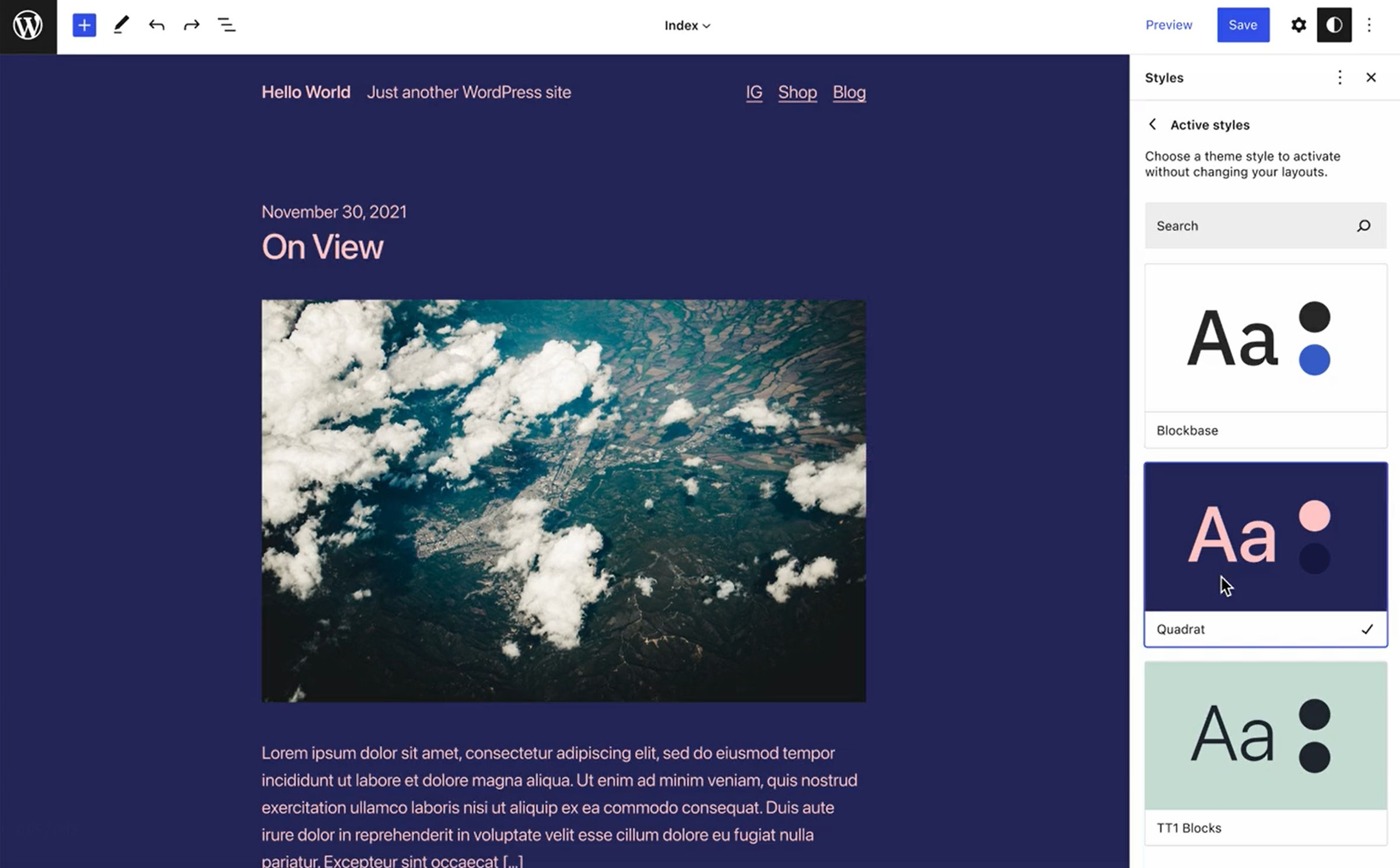
How the feature would work is not yet defined. However, theme authors would presumably be allowed to bundle separate JSON files that create user-selectable “global style variations” or “active styles” via the site editor.
It is almost as if we have come full circle. The original implementation of child themes allowed developers to create custom style.css files. The goal was to design skins that changed a site’s look and feel without changing its markup. Child themes have become much more flexible since then and can overwrite anything from their parents.
Many themers still build on top of that original concept. Their child themes are nothing more than a custom stylesheet with design modifications. The ability to bundle multiple style variations from a single theme could change how they approach design, perhaps even offering a better user experience.
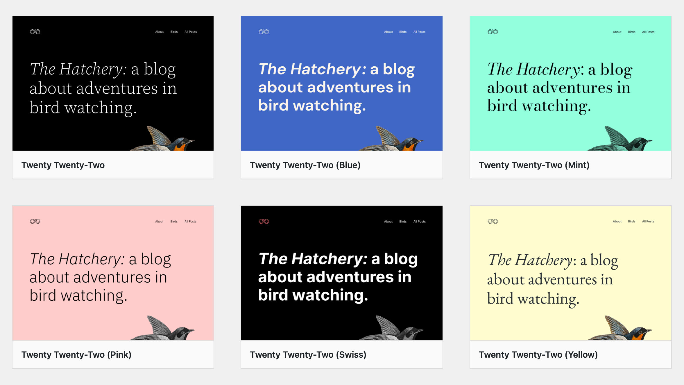
Kjell Reigstad first teased this feature last month when announcing the upcoming new default theme. “Twenty Twenty-Two will ship with a range of alternate color schemes so that folks can drastically change the appearance of their site,” he wrote in the post. The following is a video of what this concept might look like:
The UI in the video appears to be a mockup for the site editor. In the right sidebar panel, users can switch between alternate styles and find something that works well for them.
The proposal would allow for more than color palette variations. Theme authors would be able to adjust typography, layout, and anything else controllable via theme.json — essentially, the entire theme design.
Because the feature is not yet in the Gutenberg plugin or in the development version of WordPress, the only way to explore multiple theme.json files is through child theming. Yes, child themes are being used to test the very concept that could make them, at least partially, obsolete. Reigstad has an open pull request in the Theme Experiments repository to flesh out the idea.
Channing Ritter, an Automattic-sponsored WordPress contributor, shared three variations of what the user experience may look like on her blog. My preferred option is the first. It is a drill-down panel that shows “active styles” that users can switch between.

Building an active-style switcher into the global styles interface could offer that ideal user experience that child themes have never achieved. Users had to first understand how they worked, know if any existed for their active theme, install one, and activate it. Under this proposal, they could see all the styles available upfront and simply select one.
It also gives end-users who are not as design-savvy some variety without forcing them to hand-pick an entire color palette.
For a while now, I have been imagining a future where theme shops narrow their focus to one, two, or just a handful of core themes. They would then upsell access to support and a library of block patterns. Now, I envision a future where global style variations could play a part in the commercial market, offering value-adds on top of that core product.
There is also a second ticket that calls for themes to provide alternate color palettes. This would likely be much easier to implement as a separate feature because it is much more scaled back. With only a month to get WordPress 5.9 and Twenty Twenty-Two out of the door with user-selectable color schemes, this may be the more reasonable of the two routes.
Whatever the case may be, I keep finding new pet features I want to see land in WordPress. Yesterday, it was block patterns. Today, it is “active styles,” or whatever it gets called. Tomorrow, who knows? New ideas around the block system continue to keep me impatiently awaiting what comes next.
