Last week, contributors to the Gutenberg plugin wrapped up the version 12.0 release just ahead of the U.S. Thanksgiving holiday. Most work is being pushed toward the upcoming WordPress 5.9 release, which has been postponed to January 25. As a result, Gutenberg 12.0 has fewer bells and whistles and more bug fixes and maintenance. However, the latest update has a handful of enhancements.
The most notable features are an overhaul of block styles previews, grouped paragraph typography options, and block icons in the global styles sidebar. The site editor also has a new welcome guide, which should ship with WordPress 5.9 and introduce users to the new tool.
Theme authors can now opt-out of the core color palette and gradients. There is still a bug where this does not currently work for the site editor.
Block Styles Previews

For once in the last few years, the editor sidebar feels kind of clean and organized. When using a theme with multiple block styles, the style previews have been nothing short of an annoyance. The tab that held them took up a lot of space by presenting an entire demo of every option.
In the latest Gutenberg plugin release, the previews have been replaced with text-based buttons, emphasizing the style names. Users can still see what individual block styles look like by hovering over each one or focusing on it with a keyboard.
The downside to this new experience is that longer block-style names can sometimes get cut off. For example, the “Portfolio: Tilt Left” and “Polaroid: Tilt Right” options in my custom theme both read “Portfolio: Ti…” I will have to rethink their names, but that is a small price to pay for the cleaner interface.
Paragraph Drop Cap Control Moved

It seems this release has been one for fixing those irritating issues with the user experience. The option for adding a drop cap to the Paragraph block now rests alongside similar controls under the Typography block options tab.
Formerly, users had to find it under a separate Text Settings tab, which only held the drop cap option. I am sure I have mentioned this being a poor user experience on a few occasions as someone who often reaches for the control. I, for one, am a happy camper with this change.
Icons Shown in the Blocks List

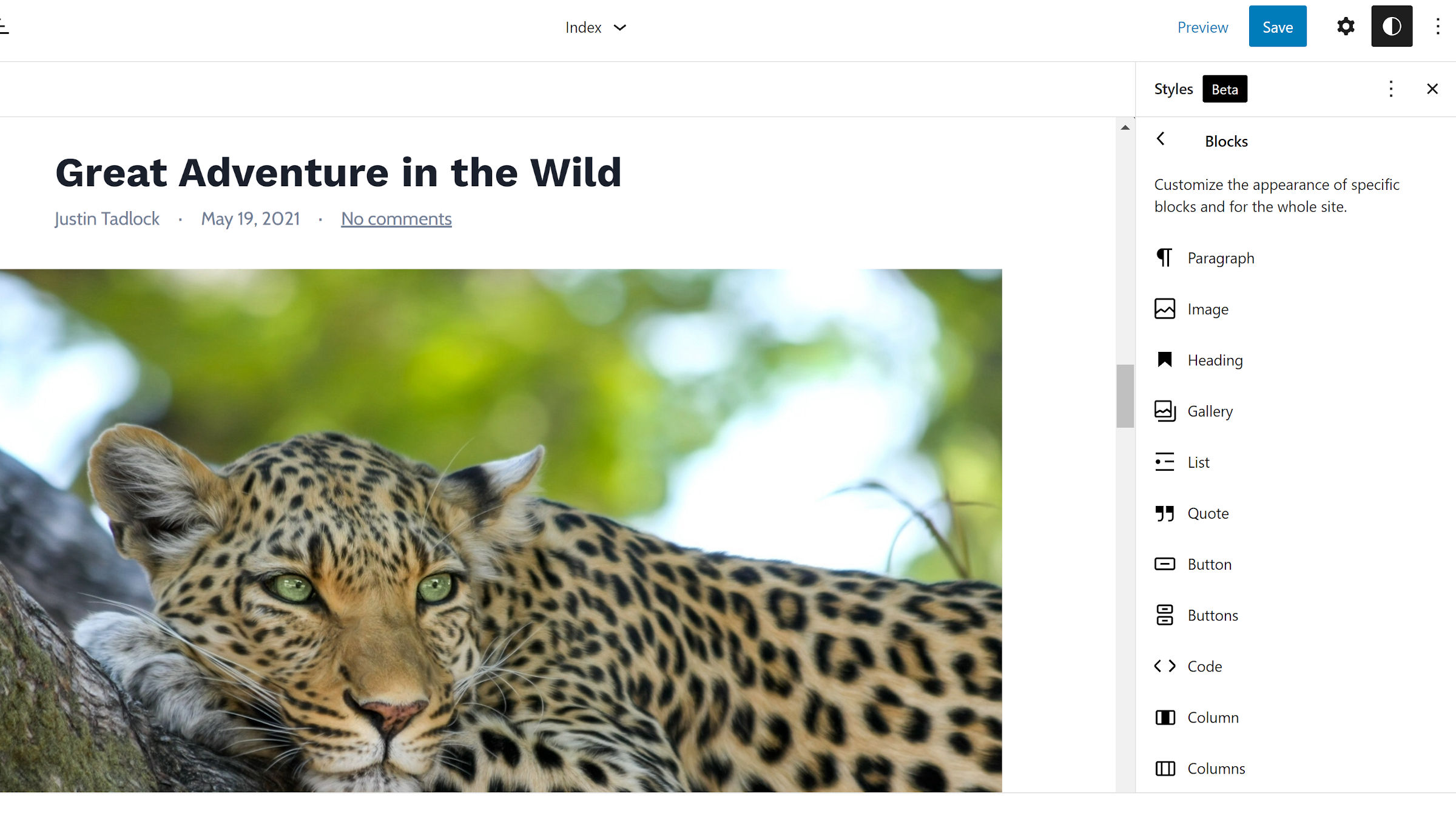
After the Gutenberg 11.7 release, one of my suggestions was to add icons to the global styles blocks list. Previously, it was a vertical scrollable area with dozens of block names, making it hard to find something specific to customize.
Whether Nik Tsekouras, who wrote the patch for this change, happened to read that Tavern post or saw the same issue with his own experience, I am grateful that he coded a solution. Finding a block is now much faster because I can just scan the list for a recognizable icon.
Themes Can Opt Into All Appearance Settings
For any theme author who has been working with theme.json, you know how unruly the file can get when enabling or disabling specific settings. A new flag allows themes to opt into support of all appearance-related options at once.
An example theme.json file would look like the following:
{
        'version': 2,
        'settings': {
                'appearanceTools': true
        }
}
Setting the appearanceTools flag to true enables support for all border, color, spacing, and typography options. This should cut back on unnecessary JSON code, especially for themers who are opting into almost everything. Theme authors can still disable specific features individually.
Depending on the theme author’s point of view, the potential up or downside to this new flag is that it will also enable support for other appearance-related features in the future. It would allow users to access new features before their themes officially support them. On the flip-side, theme authors may want more control or to run tests before enabling something new.
